PORTFOLIO > CASE STUDY: PACKAGING
Case Study
Designing a dual-language packaging system for a global wellness brand
Building Bach® Original Flower Remedies’ first U.S. dual-language packaging system, balancing brand impact with strict regulatory compliance.
Goal: Create a scalable packaging system for a wellness product line.
Result: A cohesive design system across 38 products.
In a single year, I designed packaging for more than 80 natural consumer products (160+ components) launched across the U.S. and Canada.
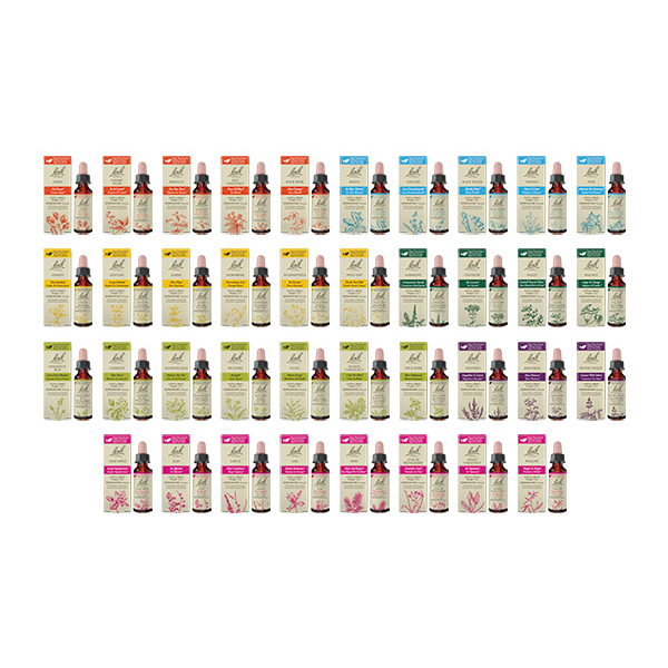
The largest portion of this work was building a cohesive, dual-language system for Bach® Original Flower Remedies: 38 U.S. products, their 38 Canadian counterparts, and related kit packaging.
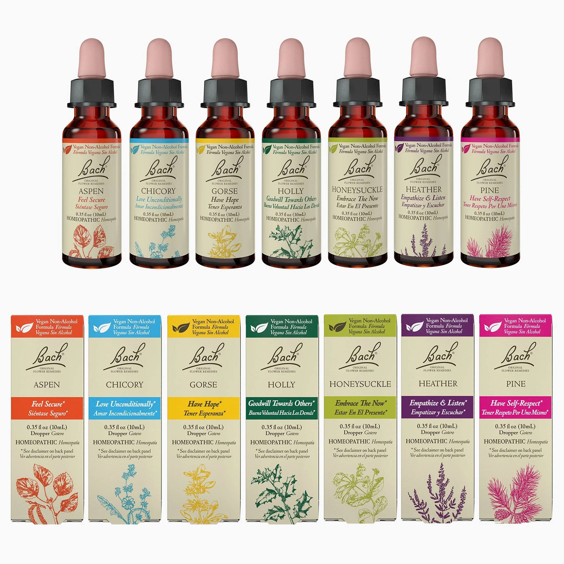
All 38 cartons and bottles for the new line.
The basis of the new system is that the 38 product line is organized by color group, of which there are 7.
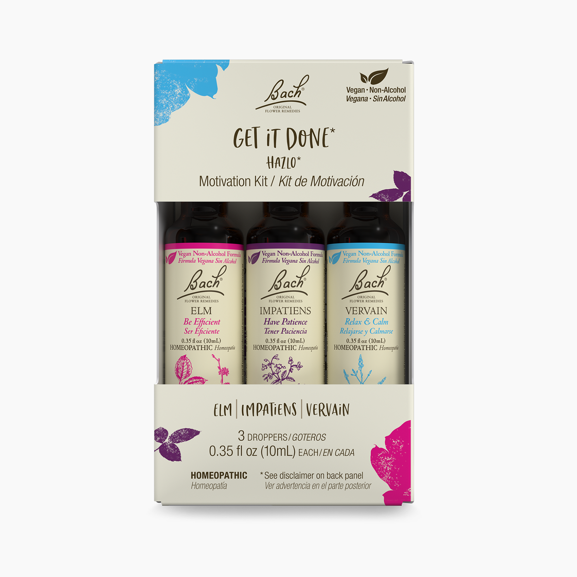
In addition, I also designed the three-bottle kits. Front of pack shown here.
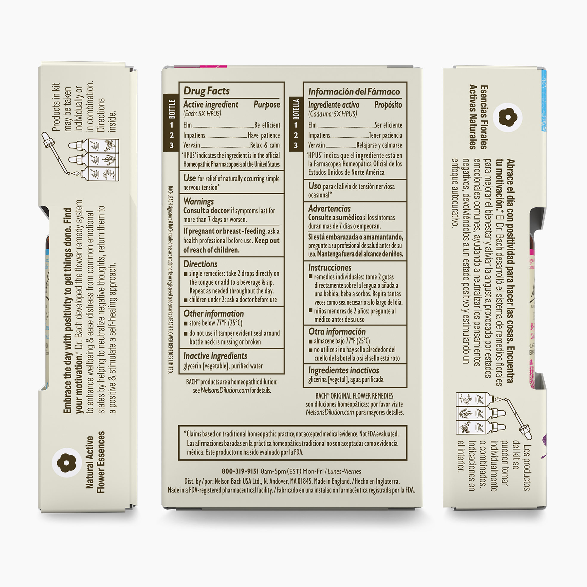
I just love organizing information for clarity and appeal. This image shows the other three sides of the kit packaging: left, back, right. It's a lot of information, but it needed to go on.
THE BRAND
Bach® Original Flower Remedies is a globally recognized brand with a long-standing heritage, developed in the 1930s by Dr. Edward Bach. Created to support emotional balance and well-being, the remedies are used worldwide during moments of stress, uncertainty, and transition. Known for its natural approach and loyal international following, the brand carries a high level of consumer trust, making consistency and clarity in packaging especially important.
THE CHALLENGE
This new line introduced a shift from the brand’s traditional 20 mL, alcohol-based format to a smaller 10 mL, non-alcohol (vegetable glycerin) formula—the first of its kind for U.S. and Canadian markets. This project required more than strong visual design. It called for a system that could:
Work across dozens of SKUs without losing clarity or consistency
Meet stringent U.S. regulatory standards for homeopathic products
Function within the constraints of small-format packaging
Introduce a first-of-its-kind U.S. dual-language system (English and American Spanish)
Remain accessible, legible, and compelling for consumers and retailers
MY APPROACH
After reviewing a wide range of initial concepts, the London-based Global Brand Manager selected a single direction. From that point forward, I led the work independently, with minimal input, which allowed for speed and cohesion.
I built the system from the ground up:
Conducted competitive and category research
Developed and refined multiple design directions
Created a scalable visual system for 38 products
Worked within established brand constraints, integrating the existing seven color categories and maintaining brand continuity
Designed all cartons and bottle labels
Prepared production-ready print files
To ensure the system worked at every level, I began with two extremes: the most copy-heavy package and the simplest. Designing both upfront ensured that everything in between would function smoothly, with no surprises later.
DUAL-LANGUAGE DESIGN
This was the first dual-language packaging system developed specifically for the U.S. market using English and American Spanish. Rather than relying on generic translation, I worked with a native American Spanish translator to ensure accuracy, clarity, and cultural relevance.
The result is a system that reads naturally in both languages without compromising hierarchy, readability, or visual appeal.
REGULATORY INTEGRATION
I collaborated closely with a U.S.-based regulatory expert throughout the process. Homeopathic products come with strict requirements, especially within small packaging formats where space is limited and precision matters.
Regulatory content was not treated as an afterthought. It was integrated into the design from the start, allowing the final packaging to feel intentional rather than constrained.
TESTING & REFINEMENT
I am a hands-on designer. I explore broadly, test rigorously, and refine continuously.
Developed extensive physical and digital mockups
Facilitated cross-functional reviews with U.S. marketing, regulatory teams, and London headquarters
Incorporated feedback from multiple stakeholders without losing clarity of vision
Used A/B testing and 3M VAS to validate design decisions
Every element—typography, color, hierarchy, and spacing—was tested to ensure performance on shelf and in hand.
TOOLS & WORKFLOW
My process integrates industry-standard workflow and packaging tools for design, collaboration, and production, including: Adobe Illustrator, Esko WebCenter, 3M VAS, BrandFolder, SharePoint, Monday, Asana, Trello.
OUTCOME
Beyond meeting requirements, the system was designed to feel clear, calm, and trustworthy for consumers. The result is a scalable system that supports a growing product line, performs clearly at retail, and meets complex regulatory requirements across two key markets for this global brand.
Successfully launched across North America, with the Canadian (English and French Canadian) variation following shortly
Supports a new product format and formulation while maintaining clarity and consistency across the line
Balances regulatory precision with strong consumer appeal
Maintains clarity across two languages and multiple SKUs
Most importantly, it works—on shelf, on Amazon, in hand, and within a highly regulated environment.